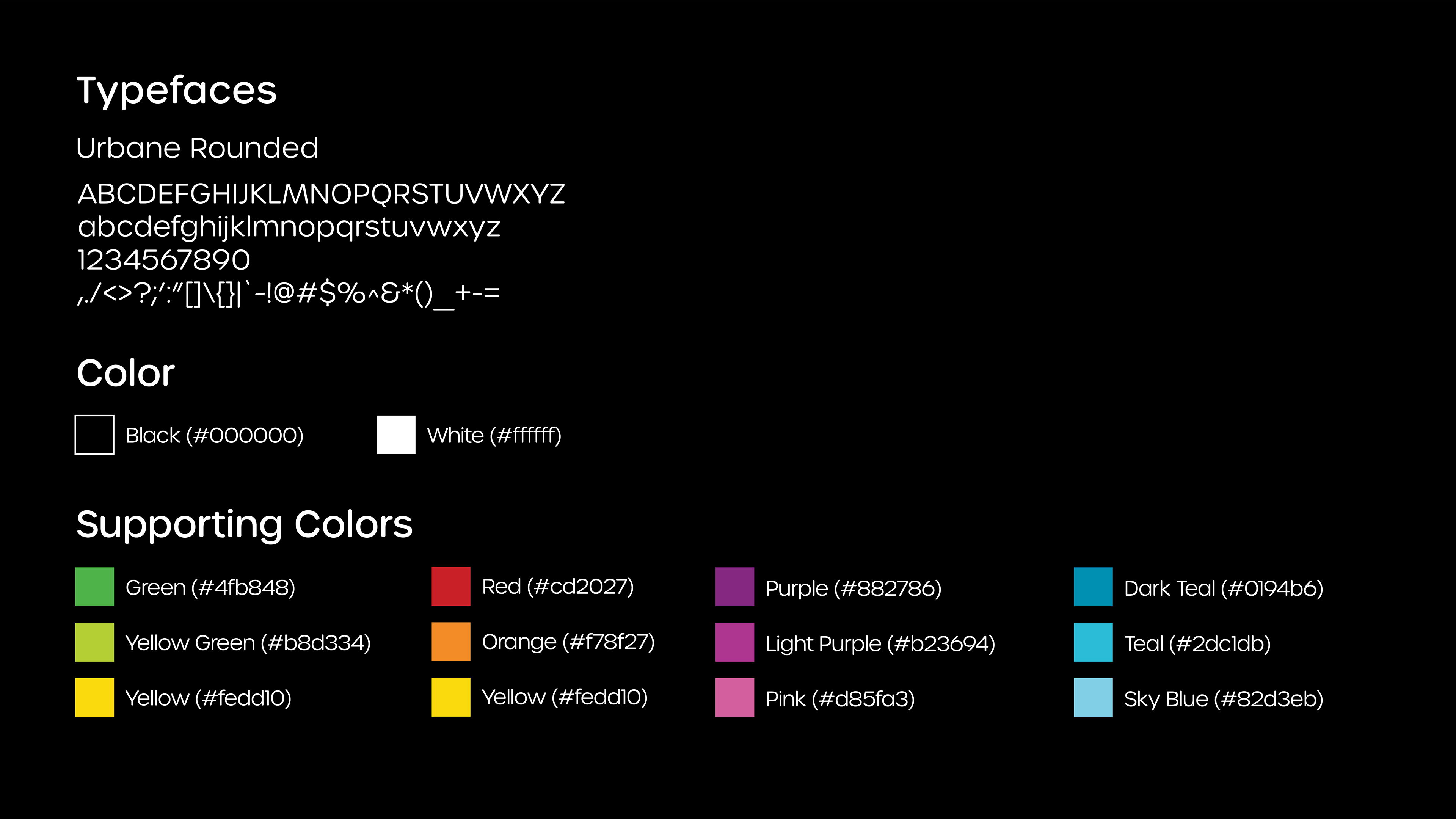
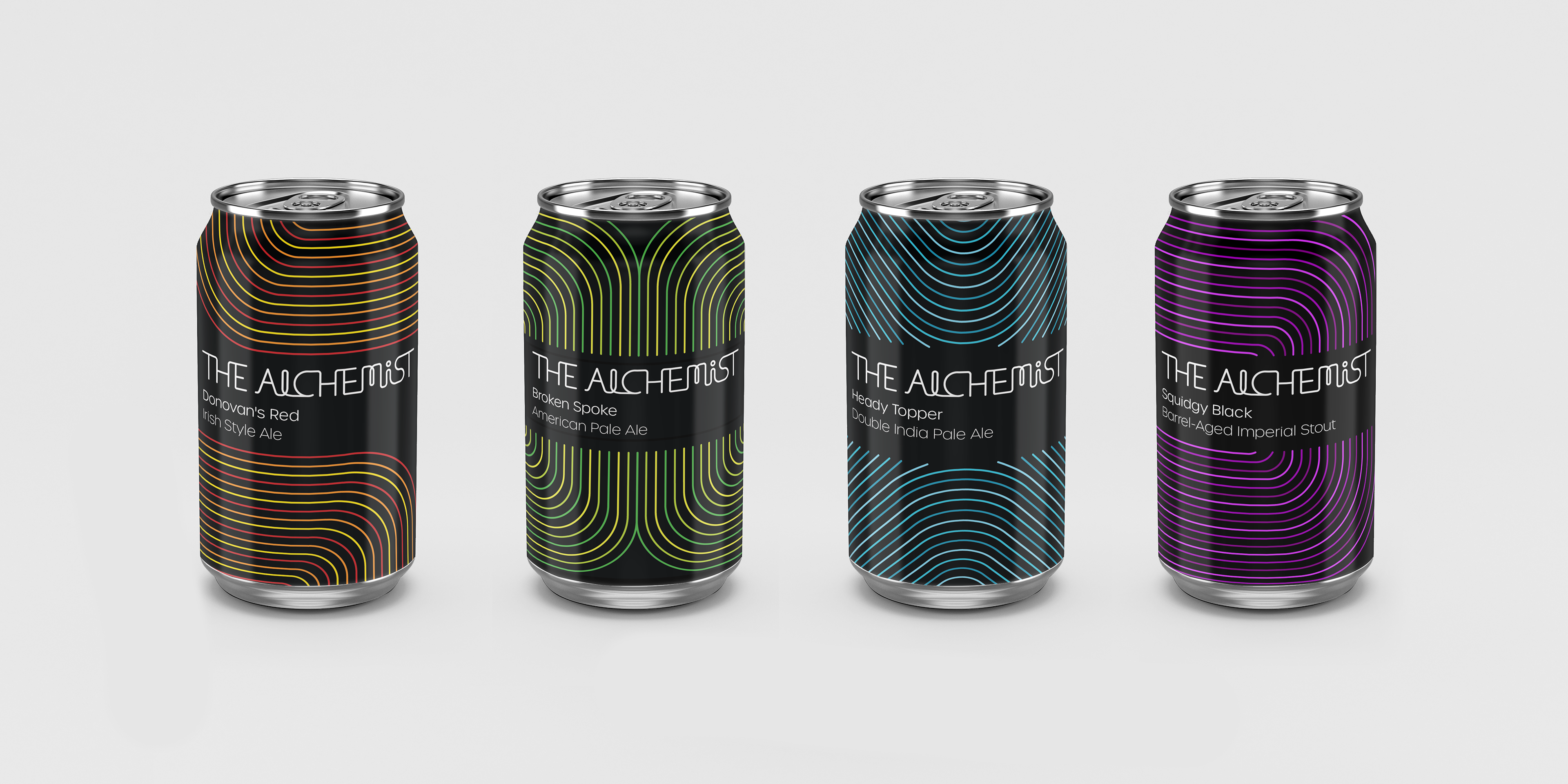
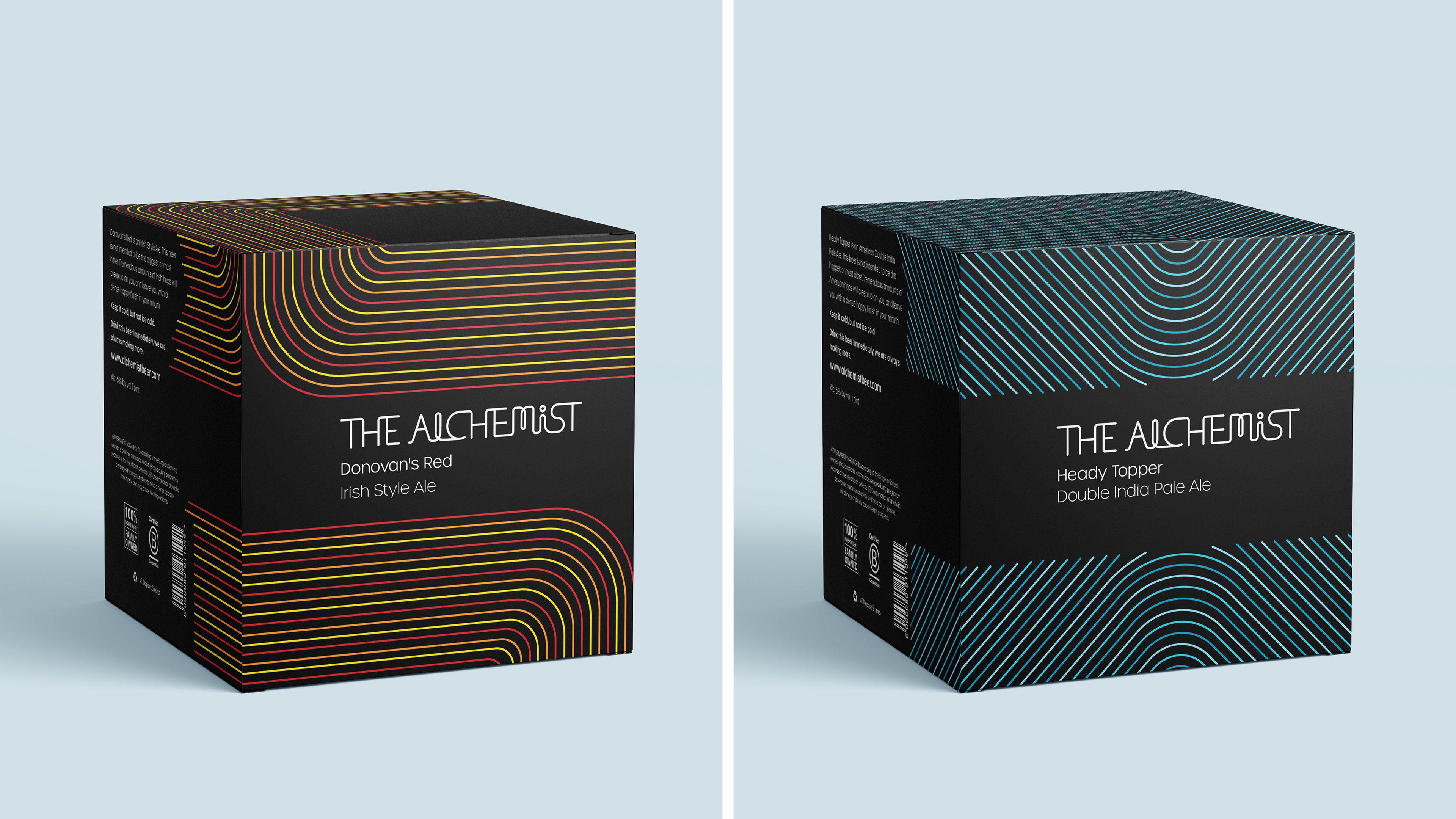
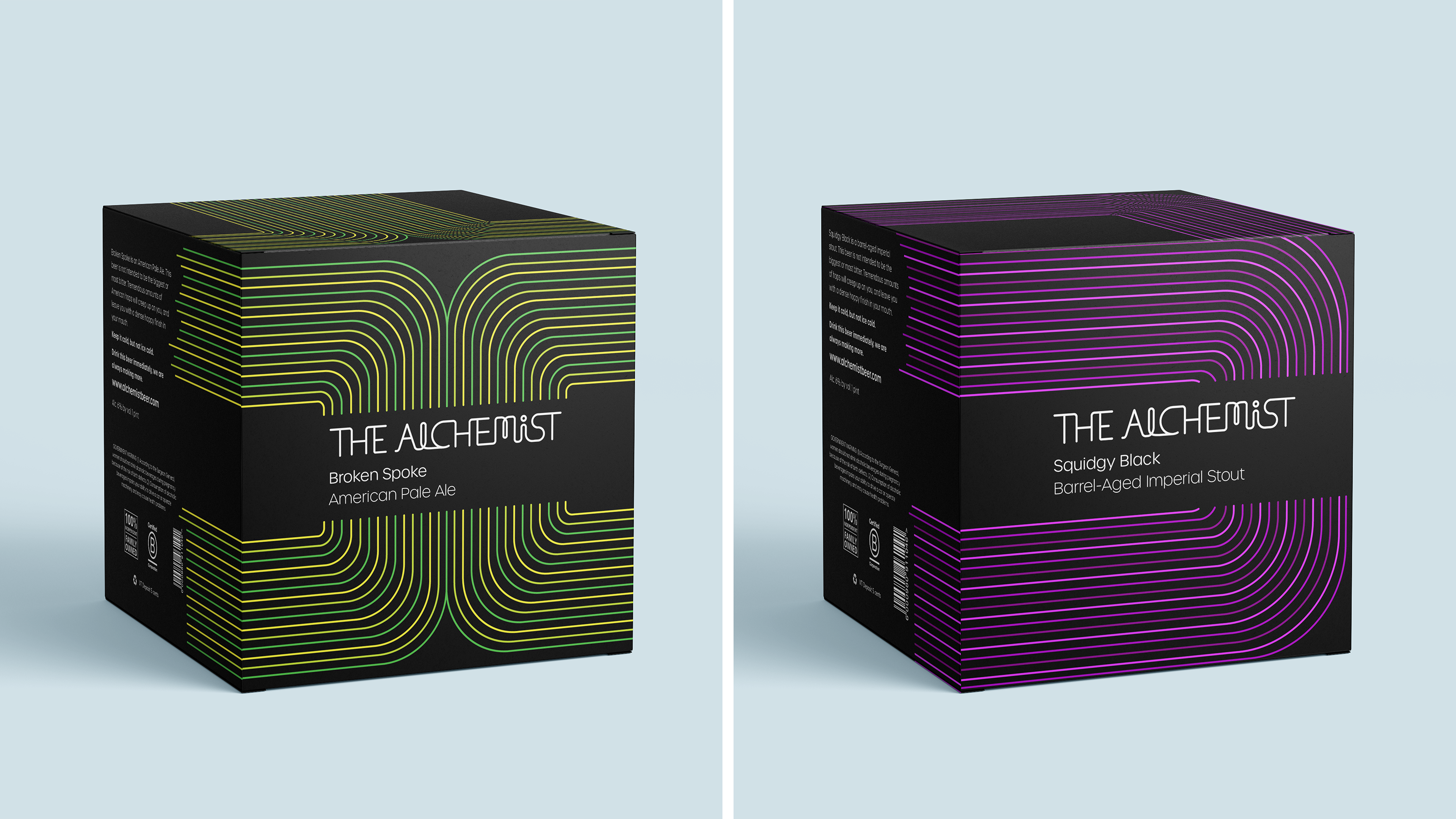
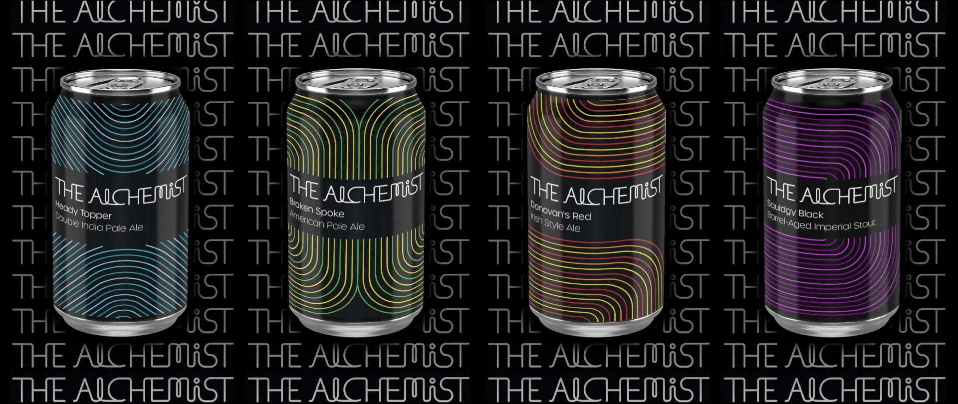
Brand redesign for the Waterbury Vermont-based brewery The Alchemist. This brewery makes beers of all types, such as IPA, stout, and ale, so a system was needed that was both diverse and versatile. The use of multicolored lines in different patterns achieved both.
Included in this project are a logo, motion graphics, packaging, patterns, and signage.


The design takes cues from tools used in the ancient craft of alchemy. Alchemy is the ancient practice of chemical experimentation that was practiced throughout Europe and Asia roughly a thousand years ago. Involved were intricate glass instruments such as bottles and pipes. The curved angles and attention to detail in craftsmanship in these instruments is reflected in this design system.

The pattern was made to create an additional design element to the system that would compliment the multicolored lines. The pattern involves simple vector shapes of alchemy tools as well as bubbles, which provides a more clear representation of alchemy for people who may not be familiar with what alchemy is. The pattern succeeds in the use of promotional material such as signage and advertising.